Believe it or not, the effectiveness of your email marketing subscription forms can make a huge difference to the success of your campaigns. After all, they’re the gateway to the channel that provides the highest ROI of all marketing activities globally. How can you create forms that work? Check out our subscription form tips and best practices below.
What to Say on Your Forms
What you say on your email marketing subscription forms is what will determine if people complete them. Here are some tips and guidelines to get you going:
1. Offer Something of Value
People are only likely to subscribe to your emails if you offer them something of value. One of the most common sources of value that brands provide is meaningful content, like a newsletter, promotions, research reports, and expert insights that you can offer as a professional in your field.
You can also offer an incentive, like a discount on the subscriber’s first purchase. Other incentive options include ebooks, access to gated sections of your site, and other free gifts.
2. Manage Expectations
All subscription forms must be clear on what the person will be opting in for. Firstly, it’s a legal requirement for data privacy regulations like POPIA and GDPR, but it’ll also increase sign ups and engagement. Why? Because when you manage people’s expectations, you increase trust. It can also potentially increase email engagement, because the subscriber has shown interest in receiving your content.
Include information like who the target audience is (e.g.: marketers, mothers, men who like sports, etc), what they’re likely to receive, and how often. If possible, consider sharing links to past content too – this way, they can see it for themselves.
3. Provide Social Proof
If you already have a marketing database, one way to increase subscribers is to provide social proof on the description of your subscription form. For instance, you could use a testimonial from a happy subscriber, or even show how many subscribers you already have with a statement like, “Join more than 2,000 subscribers…”.
4. Scrap the ‘Newsletter’
One way to spice up your communications is to call it something other than a ‘newsletter’. Opt for a name more specific to your industry and brand. Even better, pick something that describes the kind of value you’ll be adding in these communications.
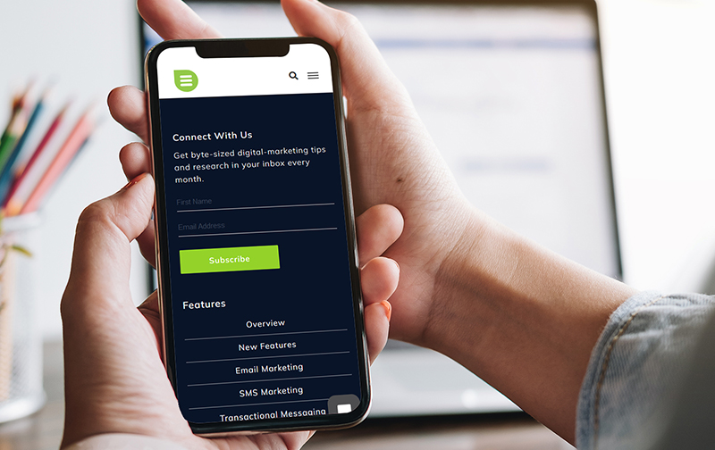
For instance, Everlytic’s monthly mailer is called Everlytic Bytes, because we share easily consumable nuggets of information on digital marketing and tips you can use to improve your campaign effectiveness.

5. Don’t Just Say ‘Subscribe’
We all know how powerful the right call to action can be. It’s any wonder then, why so many brands (including us – ahem) still settle for the word ‘subscribe’ when it comes to our marketing communications.
Test out a variety of alternatives to see which one works best for your audience. Options can include ‘Join Us’, ‘Connect Now’, ‘Sign Me Up’, or something quirky that ties into your messaging.
6. Add a Privacy Statement
Data privacy is ultra important. Include a statement about how you’ll use subscriber data – specifically noting whether their data will be shared. A great example you can use is: We guarantee 100% data privacy. Your information will never be shared.
7. Tell Them They Can Unsubscribe
Remind contacts that they can unsubscribe from your content at any point. This is a POPIA/GDPR requirement, so you must always include an easy way to opt out in every message you send. The most common way to do this is to include an unsubscribe link in your email footer. If you use a platform like Everlytic, footers like this are quick to include and the contact will be unsubscribed immediately and automatically when they click the link.
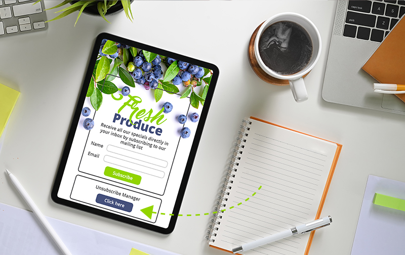
Another clever way to assure subscribers of their ability to unsubscribe is to include an unsubscribe link below your subscription form (Everlytic, for instance, enables you to create a form that unsubscribes a person from a list). This way, the contact knows upfront that there’s always a way to disconnect from your messaging if they decide to.

The Technicalities of Forms
Now that you have an idea of what to say on your forms, here are some tips and ideas on how to implement them on your website and communication platform.
8. Keep Your Copy Short & Clear
Typically, a subscription form needs copy for three things: a headline, a short description, and a call-to-action button. Make sure that the messaging you use for these is short enough to keep people interested and clear and interesting enough to entice them to subscribe.
9. Limit the Fields on Your Form
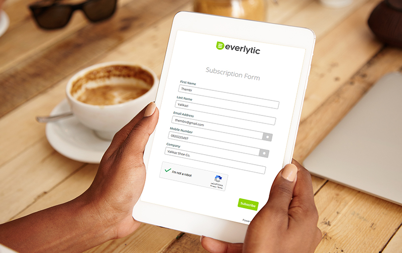
The data you have on your subscribers will help you to customise content for them. But as tempting as it is to ask people for more information on sign-up, studies show that the optimal number of form fields for conversions is three. This is because the more fields you include in your form, the more friction you create for your audience to complete the form – reducing the number of people who actually sign up.
Rather ask for the necessities to get them through the door. Once they’re on your list, you can collect more data using surveys, update-profile campaigns, and by tracking behaviour using message engagement tracking and features like interest-based tagging.
10. Continue the Customer Experience
Typically, when people complete subscription forms, they see a thank you message and that’s where the journey ends. This is wasted real estate – especially if these people are engaged enough to complete a form. Consider directing them to another high-value page on your website instead, using CTA buttons and enticing copy.
Tip: Send an automated welcome email or series of emails when people subscribe to your list. This way, you engage with them in real time.
11. Use a Double Opt-In on Forms
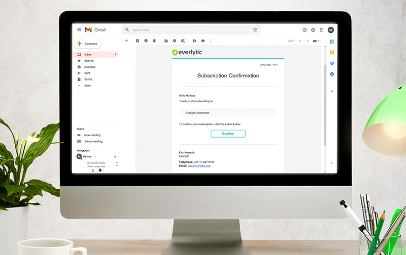
Double opt ins are a way of filtering bot traffic and less engaged subscribers from your list before they even join. The way this works is: once the subscriber has completed the subscription form, your communication platform triggers an automated email asking them to confirm their subscription. Only if they click the link in this email will they be added to your database and start receiving your communications.
Tip: When using a double opt-in form, make sure you alert subscribers that they’ll need to check their email to confirm their subscription.
Granted, a double-opt-in form may slow down the growth rate of your database, but what exactly is the value of a large, unengaged list? The point of sending communication to people is for them to read and engage with the content – hopefully increasing their chances of buying from you. A list of unengaged contacts won’t give you that. Plus, it can even decrease your future emails’ chances of landing in contacts’ inboxes.

Where to Put Your Forms
To ensure people subscribe to your list, it’s essential that they can see your form. For newsletter mailing lists, scatter them throughout your website – especially your top-performing pages. The more your visitors see your form, the more likely they are to take note of it and complete it.
Here are some other places you can put your subscription forms:
- Website sidebar: This is highly visible on webpages.
- Bottom of blog posts: People who read to the end of your content are more likely to be engaged email subscribers.
- Website footer: This offers a standard next step for all your visitors, no matter what page they’re on.
- Blog header: Blog readers are more likely to want to read your email content too – catch them when they arrive.
- In a guide: If you create long-form content like guides, invite readers to subscribe to your mailing list too.
- At checkout: If you run an ecommerce store, include a checkbox on the checkout form that enables them to subscribe to your newsletter list.
- In the homepage feature box (near your hero image): If sharing valuable, targeted content is your thing, invite people to sign up right on the home page.
- On social media: Link to a subscription form page from your social campaigns.
- In your physical store: Use a tablet device to collect email subscribers while the cashier rings up their purchases.
Start Using Forms Today
Knowing how and where to best use your subscription forms can have a huge impact on the number of potential clients you’re able to reach, and the value this can add to your brand as a whole. Who knew subscription forms could make such a difference to your business?! We did. ????
Master Your Bulk Communications
Everlytic is built for marketers like you. From our drag-and-drop form builder, automated database management functionality, and easily customisable email templates… We’ve got what you need.


