We’ve shared valuable content about email creation over the last few weeks, including the three main email design types, copywriting for email marketing, and elements for top email design. This is because emails that are well designed are typically more engaging, and as a result, can improve conversions. Ready to take your email design up another level? Here are 4 email design tips that can improve engagement and drive conversions.
1. Create Emails That Have Visual Hierarchy
In email design, visual hierarchy refers to the order that you use to arrange different graphic elements around text. Readers tend to follow predictable patterns when engaging with content. Visual hierarchy means you can use this to your advantage; helping readers to consume more of your content with less effort. It also directs their eyes to the most important elements within your email.
Did you know that the human brain can process visuals 60,000 times faster than textual information?
Here are three email design layouts that showcase visual hierarchy well:
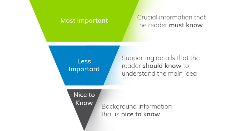
- The Inverted Pyramid
As we mentioned in our copywriting for email marketing blog post, online readers rarely read everything you put in front of them – they scan. The inverted pyramid can help with this by sharing the most important info first, descending by level of importance as you progress in the email.
For example, if your primary goal is to get signups for a webinar, include a call-to-action button right after your first paragraph. You can then include the rest of your content below that.
- The F Pattern
The F pattern takes advantage of how the eyes naturally move across and down a page in the shape of an F. For instance, readers tend to see the top headline first, followed by sub-heads, first lines in paragraphs, and bullet points. It’s a popular visual hierarchy pattern as it makes it easy to scan content – especially in single-column email templates. It’s also considered one of the best options for mobile-optimised messages.
- The Z Pattern
The Z email layout is designed to manipulate eye movements and is a good way to get subscribers to read through more of your content. It works on the premise that, when reading content from left to right, recipients tend to skip ahead as they engage. The Z pattern takes advantage of this tendency by spreading eye-catching content, especially images, throughout the copy. This way, readers are less likely to disengage halfway through.
Email design layout tips:
- Use contrasting colours to distinguish between different elements, as readers (especially those who scan emails) will be intrigued by the clear change in design. Make sure that your call to action stands out from the other email content too.
- Use white space to separate sections. This shows the reader where each element begins and ends, creating visual breathing room and sharing info in a clear and organised way.
- Improve email accessibility. The World Health Organization (WHO) estimates that 15% of the world’s population has a visual impairment. Ensure that your emails can be easily read by all contacts.
- Try to use textures instead of solid colours as visually impaired subscribers can’t differentiate between certain colours.
- Include ALT text for all images as some recipients use assistive technologies like screen readers to interpret online content.
- Use icons and labels to convey information. For example, when filling in a form, a visually impaired reader won’t be able to see a field error if it gets highlighted in red.
- Avoid using very small font sizes.
2. Use an Email Template for Efficiency
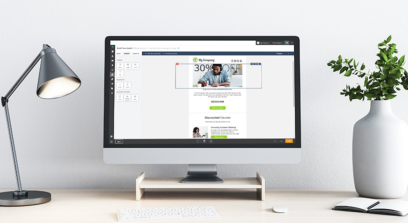
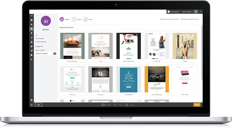
Email templates make designing visually attractive emails quick and easy. With a platform like Everlytic, you don’t need to be a professional designer, but you can look like one thanks to the drag-and-drop editor. You can also make it your own by applying your branding or corporate identity (CI) – in fact, we recommend this so your recipients become familiar with your brand.
Tip: Align the look and messaging in your emails with the look and messaging in the pages you link to, so the customer journey is seamless and understandable.
All Everlytic email templates are screen responsive. The layout of the content is automatically adjusted based on your device type, screen size, and email client.
3. Add Interactive Content in Your Emails
An interactive email design enables subscribers to interact with your content without navigating out of your email – increasing engagement and, according to Digital Resource, providing up to 2x higher conversions.
According to Dripple, interactive content can increase your click-to-open rate by 73%.
These are some of top interactive email elements to consider this year:
- Countdown timers
- Product carousels
- Add-to-cart functionality
When you plan in your interactive elements, remember that not all email clients will display them perfectly. To ensure an optimal user experience, test your emails on different email clients first (or use Everlytic’s viewing test function to see examples of how your emails could look in a variety of different email clients).
Note: Use interactive content sparingly to avoid overwhelming the reader.
4. Use Dynamic Content to Personalise Emails
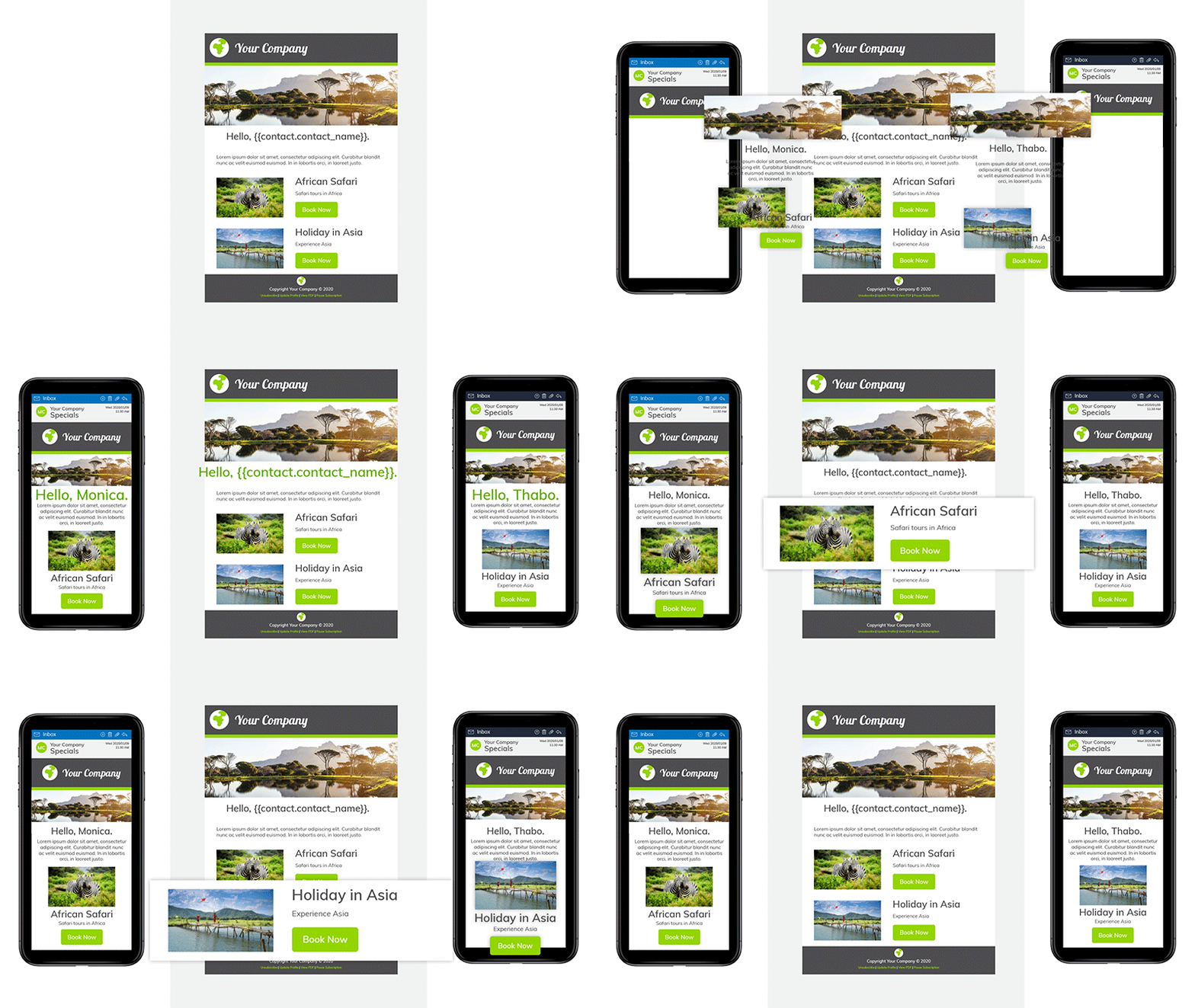
Dynamic content enables you to cater for multiple segments of your audience within the same email – saving time on email creation and customising the experience for different people in your database. It does this by allowing you to programme each section of the email to be seen only by groups of your audience that you specify.
For example, you could send out a promo email and customise it to show male products to men and female products to women.
While features like email automation and database segmentation enable you to send hyper-personalised messages to your subscribers, dynamic content enables you to reach a different level of personalisation. This results in the most innovative, and subscriber-relevant email designs.
Design Your Emails for Conversion
Strong and effective email designs can impact their performance. Test the tips in this blog post and monitor your email metrics with a platform like Everlytic to see what works best for you and your audience.
Effortlessly Create Eye-Catching Emails
These days, you don’t need to be a designer or know how to code to create an attractive email. With a platform like Everlytic (and the tips in this blog post), you can use our drag-n-drop builder, easy branding tools, and pre-designed templates to send professional emails quickly and effortlessly, every time.

