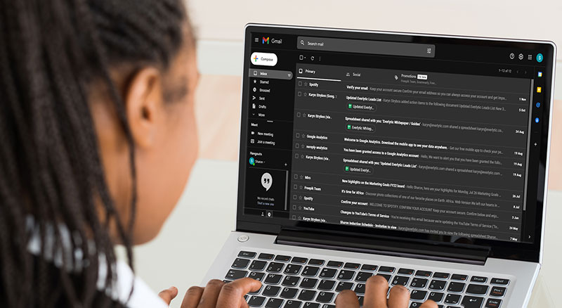
A survey by Polar shows that 95% of people prefer to use dark mode. Since your readers may be choosing to view emails in dark mode too, it’s probably best to offer them dark mode compatible emails. With a few simple changes to your email designs, you can deliver the same user experience as you do in light mode, if not a better one. Are your marketing emails ready for this trend? Read on.

What is Dark Mode Compatibility?
Dark mode is an app setting users can activate that inverts a white background and black text to a black background with white text. It’s one of the biggest digital design phenomena to impact Apple’s OS, Slack, Facebook Messenger – and many more apps. Be ready to adapt, because it’s here to stay.
Advantages of Dark Mode for Users
Here’s why your email readers may prefer dark mode:
- Battery advantage. It reduces screen brightness, saving battery life. It can reduce battery usage by up to 63% on AMOLED display.
- It’s easier on the eyes. Light text on a dark background minimises eye strain, especially in low-light situations.
- Improved content legibility. It can enhance content legibility, making it easier for users to consume on desktop and mobile.
- Accessible content. Generally, dark mode makes content more accessible for readers with vision impairments.
- Less disturbing for others. Dark mode is discreet. Less light means it’s less likely to disturb others.
- Prevents migraines. Patients with photophobia can switch to dark mode, as it may help prevent migraines.

Email Clients with Dark Mode Settings
Here are clients that offer dark mode email settings. Note that some of these apps automatically detect the user’s preference:
- Apple Mail platforms (on Apple Mail desktop app, iPhone Mail app, and iPad Mail app)
- Gmail (on web browser, Android mobile app, and iOS mobile app)
- Outlook (on Outlook.com web browser, Mac desktop app, Windows desktop app, Android mobile app, and iOS mobile app)
- Yahoo (on web browser, Android mobile app, and iOS mobile app)
Optimising Emails for Dark Mode
These are some of the steps you can take to provide a better email user experience and compatibility in dark mode.
1. Save Images as PNGs with Transparent Backgrounds
A good practice for email designers. When your images are saved as a transparent PNG, the background colour change in dark mode will appear to be seamless. Whatever colour the background changes to, it will be reflected in the background of the image.
Additionally, make your dividers / spacers transparent too. This ensures that your email looks as it’s meant to when viewed in dark mode.
2. Include White Outlines Around Black Design Elements
If your marketing emails include dark design elements like text, images, or icons, it’s best to add a white outline around them. This is an effective way to ensure your emails are readable and actionable. The white outline won’t be visible in light mode, but it helps elements stand out when viewed in dark mode.

3. Avoid Using True Black as a Background Colour
Consider using dark grey (Hex code 121212) instead of true black as a background in your emails. White text or icons on a pure black background can cause a high contrast that may be exhausting for the eyes. Dark grey surfaces make it easier to distinguish shadows and represent a range of elevation, depth, and colour.
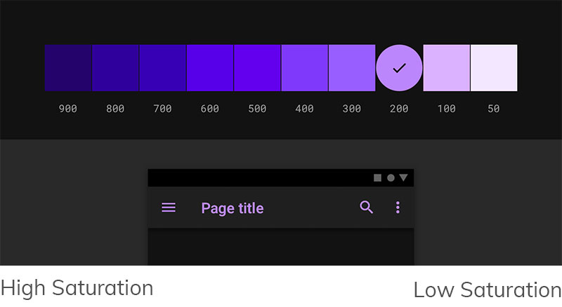
4. Avoid Using Saturated Colours on Dark Backgrounds
Whether on images, buttons, or text, saturated colours look better when used on light backgrounds. But the same colours can look disturbing on dark surfaces and can be difficult to read. Consider using desaturated primary colours that will deepen the contrast and increase readability when placed on dark surfaces.
Best practice: Use colours in the range of 200-50 as they may increase readability in dark mode emails.
Image source: UX Planet.
Email Deliverability in Dark Mode
Your emails need to be designed to render well in dark mode. If not, there’s a possibility spam filters may be triggered because images form part of the determining factors of email delivery.
Additionally, readers may end up avoiding your emails because of poor appearance and may even mark them as spam. Most importantly, test your marketing emails before sending them.
Dark Mode: A Popular Design Trend
As a marketer, your emails may need to be optimised for dark mode compatibility, because a high number of users prefer this setting. Make the necessary changes to ensure that your email design delivers a great user experience no matter how it’s viewed.


