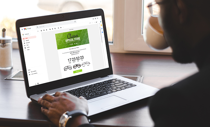
Designing highly engaging emails is an art and a science. Believe it or not, there’s a lot of psychology in creating email designs that people engage with. To get started, it’s important to know the fundamentals and build from there. So, first up, here’s the importance of email design and the three main email design types you’ll need to understand to optimise your email marketing ROI.

Why Should I Design My Emails?
How many times have you heard the saying, ‘a picture is worth a thousand words’? Countless times, right? This is because it’s true – especially in these digital times. People are so bombarded with information online that they don’t read much anymore. They scan. And when people aren’t fully consuming your content, they’re less engaged and less likely to convert to paying customers. Design changes that.
With email design, you can optimise content for digital readers – making it easier for them to consume more of your messages. Additionally, Winnow Creative says well-executed design “builds credibility and brand recognition by creating a consistent visual language, providing an instant connection to your services or offerings.” In other words: the design of your emails helps you communicate and build more effective relationships with clients.
The 3 Main Email Design Types
In Everlytic, you don’t need to know about email design types to send attractive emails – you can just use our drag-and-drop email builder and customise one of our pre-built, screen-responsive email templates. But, if you’re serious about optimising your email marketing and getting the highest ROI on every message, it helps to know when to send which type of email and how to customise them, so they’re fit for purpose.
To start, here are the 3 main email design types currently used:
1. Rich Text Emails
Rich text is the most popular form of email design, giving you much more flexibility for its look and feel. For instance, you can customise the size and style of your fonts, insert links, use bullets, colours, images, GIFs, a customised structure, and more. This offers you and your brand much more room to play – which can better support people who scan emails and may increase conversions as a result.
When rich text emails first became available, you needed a web designer to put them together for you. This meant that designed emails were something only bigger brands could create. Today, however, there are online tools available (like the Everlytic ones we mentioned) that make creating eye-catching emails quick and easy for anyone.

The only downsides are:
- Rich text emails are typically bigger than plain text ones, so may not always be downloaded (though there are ways to reduce this, like by not embedding images).
- They’re often displayed differently in different email providers (Everlytic’s inbox testing feature can help you with this).
- Not all designs are responsive to different screens (although you won’t need to worry about that with Everlytic’s email builder – all emails are responsive by default).
Rich Text Use Cases
With most emails on the web being sent in rich text, their use cases are broad. Some of them include:
- General business emails to employees and / or clients
- Service-delivery emails
- Marketing emails
- Onboarding journeys and lead-nurturing series
- Educational emails
- Automated RSVP mailers
- Transactional emails
2. Plain Text Emails
Plain text emails are as simple as they come. They include only basic text and have no option for images or customised fonts. Even though they’re plain and simple (and don’t have much to work with in terms of design), they have their place.
For instance, they’re usually included by default. It’s best practice for email service providers to automatically include a plain text version of every email sent. This is because designed emails can display differently in different email platforms. With a plain-text version available, all recipients can read your mail. Spam filters consider plain-text alternatives to be a sign of an email’s legitimacy too.
Plain text emails are also more personal. Without branding, the sender appears to be speaking only to the recipient rather than to a bulk audience. The lack of styling, images, or other design elements can get boring though. Additionally, as mentioned above, your message may be at the mercy of people who scan rather than read.
Plain text emails aren’t used often anymore (we even use rich text emails in Outlook – email signatures often require it), and we don’t recommend using them for marketing (apart from serving as a backup for rich text versions), but some potential use cases could include:
- One-on-one business emails
- Sales emails that need to look personal (these can be sent out in bulk but look like they are sent from a salesperson directly)
3. Interactive Emails
Interactive emails are still relatively new in the world of email design. The idea with these emails is to give the recipient the ability to interact with as many elements as possible before needing to click through to a web page to convert. This reduces the resistance some recipients may have to clicking through, because the email functions as a mini web page.
Interactive elements can also move – this serves as a differentiator to most other emails in people’s inboxes, which may increase the chances of recipients engaging with them.
The interactive elements currently available in Everlytic include:
- GIFs
- Rotating banners
- eCommerce products pulled in from your Shopify, WooCommerce, or other custom store via our simple integrations
- Video preview images that click through to videos on YouTube or Vimeo
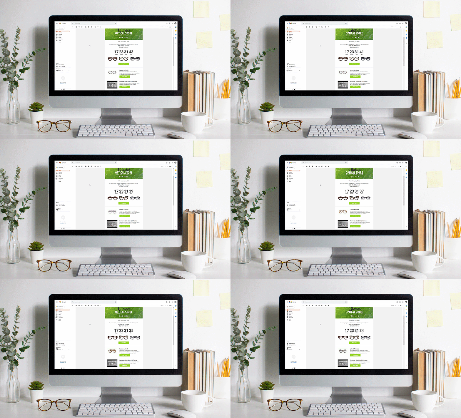
- Countdown timers

While these kinds of emails are very exciting, the most advanced functions, like polls, games, and shopping carts, aren’t supported by all email clients. This has slowed the adoption of interactive email elements across the board.
Get Started with Email Design
High-converting email design is fun; especially since email technology is constantly evolving. Which type should you use for your emails? It depends on what your goals are. For us, we like to include a combination of all three wherever possible (because we can). Watch our blog and social media pages for more email design guidelines and tips coming soon. ????


