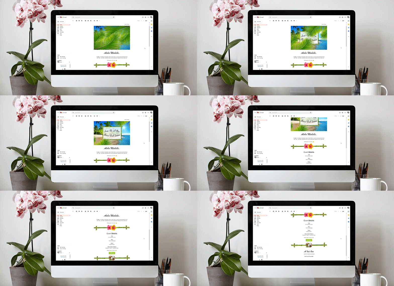
Email design is an exciting and constantly evolving space to play in. Are you up to speed on the latest email design trends? By being more creative in this space, you can often increase email engagement, increasing a reader’s familiarity with your products and services, and potentially increasing clicks and conversions. Here are some of our favourite 2022 email design trends for you to consider for your next campaign…
Simple & Clean Designs
Minimalism has been a trend in design for a while. Keeping it simple doesn’t necessarily mean writing plain text emails though. You can still include clean, attractive graphics (maybe even one that moves), but the focus is on the message in the copy. The design provides a refreshing backdrop on which the reader can peacefully absorb the written content – like sitting on one of those huge bean bags.
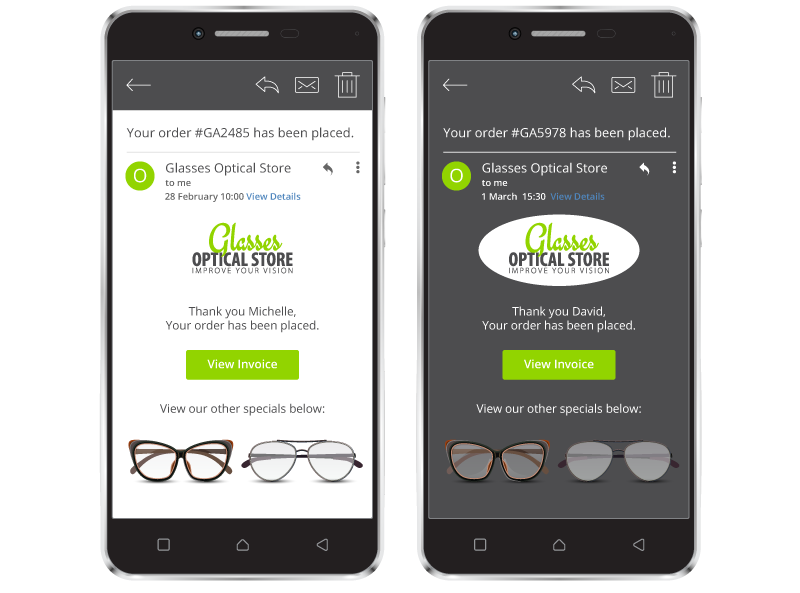
Designing for Dark Mode
The use of dark mode has steadily increased over the years, which has made it a notable design trend for email. With the benefits on battery use, gentleness on the eyes, especially in low light, we imagine this trend won’t go away soon.
Dark mode email compatibility: are your emails optimised? Here are some tips to get you started.
Wave & Arch Designs
Arches and wavy lines came up repeatedly in our research on this year’s trends. According to Litmus, this ties into the retro-style designs that have been trending recently. The design trend removes the box-like lines commonly used in email design, opting for a softer approach that just looks fun, and may even gently guide the reader to your content and calls to action (CTAs).
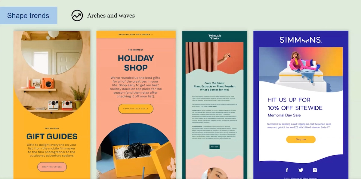
Source: Litmus
Typography & Font Fun
They say a picture is worth a thousand words, but what about a picture created from words? That’s what designing with fun typography can do. Because who said you have to write every word in your email in a straight line? And, interestingly, because using text in unusual ways in images is novel, it catches the eye, enticing recipients to read more.
Tip: When using typography in email images, keep an eye on how the image will look on mobile. Small text may not be easy to read on mobile.
Note: Using images with fun fonts in your emails can be engaging, but we don’t recommend going wild with fonts in your email text. This is because many of the creative fonts you can use aren’t email safe. Here are some email-safe fonts you can use in your text.
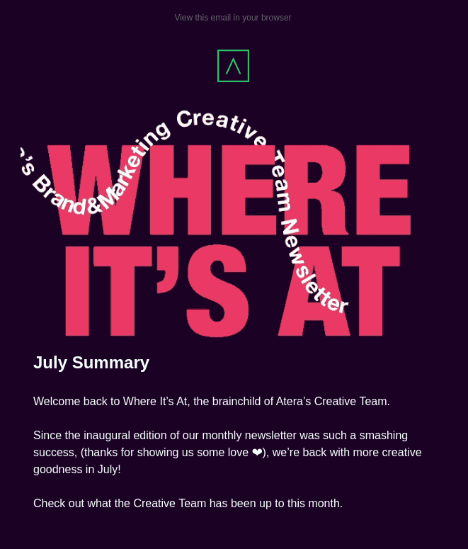
Source: Really Good Emails
Multi-Shade Email Design
Duo-tone emails are trending. This striking email design strategy uses contrasting colour to simplify the design and catch the reader’s eye. It makes us feel like we’re looking at the negative version of a photo.
Multi-shade gradients are also on trend, making us reminiscent of school projects designed with Microsoft Word’s ‘Word Art’ tool in the 90s. The dreamy, nostalgic feel of these designs can be used subtly too, tying it into an otherwise simple and clean design.
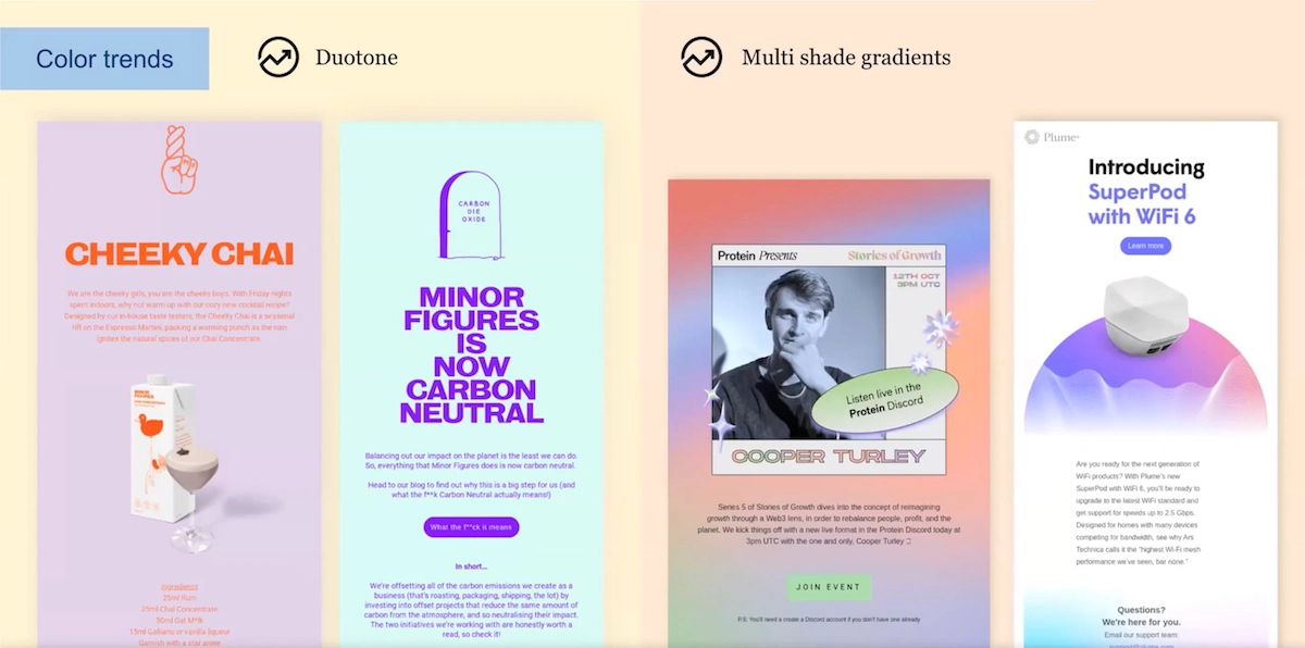
Source: Litmus
Email Designs that Move
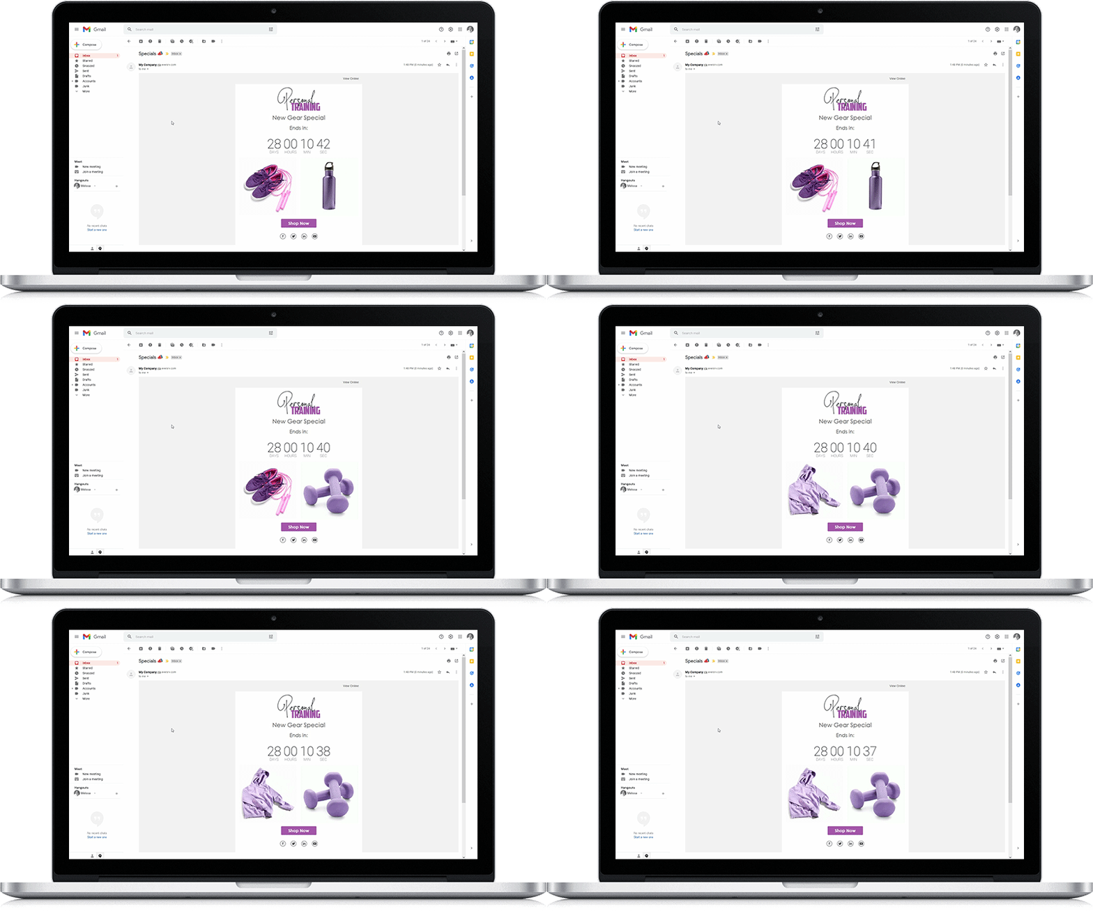
It wouldn’t be possible to get through a blog post on email design trends without something interactive. After all, interactive email designs are a big trend. The most used interactive elements used are:
- GIFs: These can be animations that move or work like silent mini video snippets in your emails.
- Countdown timers: These are great for creating a sense of urgency in promotional emails.
- Rotating banners: Like on a website slider, rotating banner images enable you to rotate between a few different images, sharing a story or a variety of information in the one design element.
Email marketing is about constant trial and error – and often, this can be a lot of fun. Try out some of the design trends in this blog post to see if they make a difference in your campaigns.
Designer? No Designer? No Problem!
With Everlytic’s selection of pre-designed, screen-responsive email templates and our drag-and-drop email builder, creating eye-catching emails is quick and easy for anyone – if you’ve got design experience or not. Alternatively, import your own email designs from a ZIP file or a URL.

