
Welcome to the second part of our two-part blog series on how to get the most out of your landing pages.
In Part 1, we covered:
- What landing pages are
- What to consider in planning
- What the best practices are
In this week’s post (Part 2), we’ll explore:
- What the elements of a good landing page are
- Some examples of good landing page design
Happy learning!
Landing Page Design Elements
If you’re just getting started with landing page design, we recommend sticking to the following basic properties until you’re more comfortable:
1. Your Unique Selling Proposition (USP), focused on a single proposal like downloading a PDF or signing up for a service. This should include:
- The main headline
- A supporting headline
- A reinforcing statement
- A closing argument
2. The “hero shot”: an image or video showing your product in use.
3. Benefits of your offer, including:
- A bulleted list summarising the benefits
- A short description of features and benefits (one or two lines) with a CTA above the fold. For extra copy tips see this guide.
4. Social proof, such as testimonials or logos of well-known businesses that use your product.
5. A single call to action, with or without a subscription form.
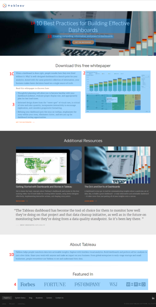
Here’s how Tableau uses these elements. Once you’ve collected interaction data on your landing pages, refine these elements for better performance.
Examples of Great Landing Pages
Here are some standout landing pages:
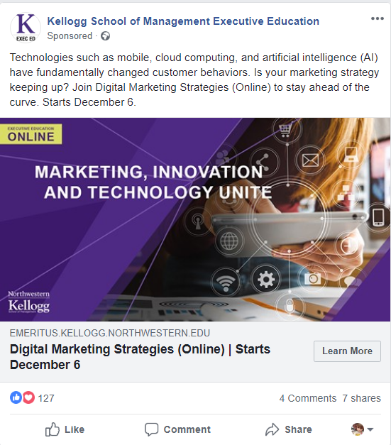
- Kellogg School of Management Executive Education
Big image, clear description, obvious CTA—all above the fold.
- Sanlam
Simple, eye-catching, with one clear CTA and quality video to entertain and inform.

- Writer’s Life
No images—strong copy appeal and simple form can work just as well.

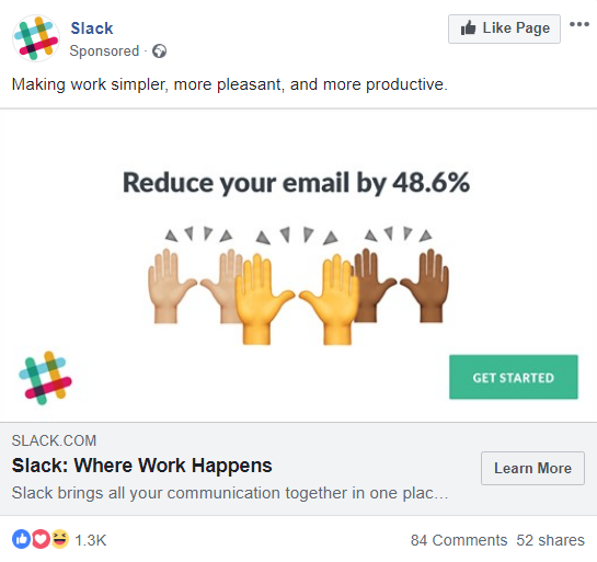
- Slack
Short description, playful imagery, minimal requirement—all to increase click-through.
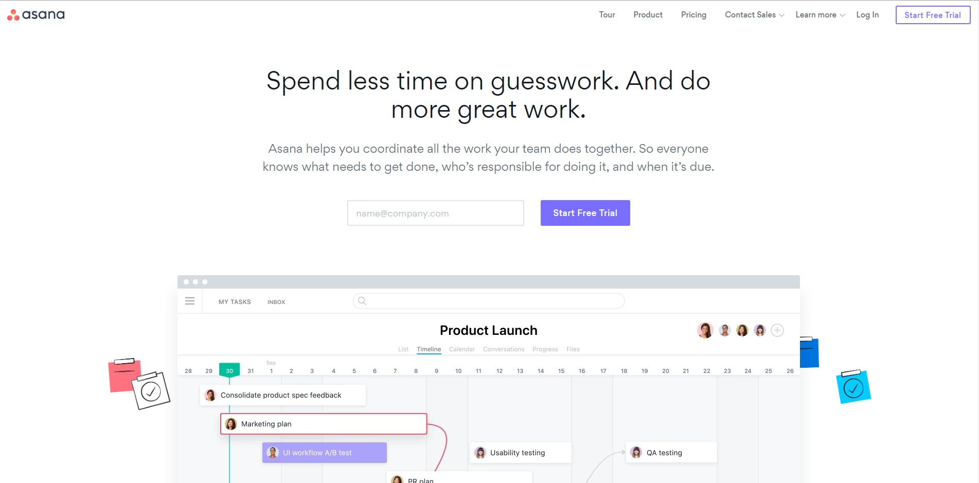
- Asana
Sharp message, clear CTA, key info above the fold—scroll for more if needed.
Conclusion
When building your landing page, ensure a single goal with all elements guiding readers to one clear CTA. This is highly effective for gathering info, converting leads, and growing your newsletter database.
Once you’re comfortable with the basics, experiment and analyze landing-page performance to see what resonates with your audience.
Try it. It’s worth it.